Wheelchair Accessible Residence by Juliana Santana

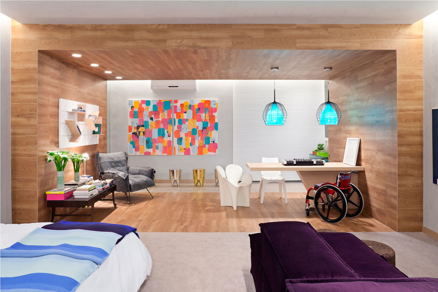
Modern and chic are words that easily describe this wheelchair accessible residence by Brazilian architect Juliana Santana. In preparation for the 2011 Casa Cor Brasilia, a large architectural event in Brazil, she decided to design a residential space for those with disabilities. I first saw this space while browsing Dwelling Gawker which is a great place to view beautiful and innovative architecture and interior design. That led me to an article in Casa de Valentino; here is a little more on what they say about the space (the article was in Portuguese and translated through Google Translate):
Designed to meet the needs of a young athlete, joyful and attuned to the urban trends, the project brings together renowned international design pieces as well as contemporary works of art. The architecture is simple and straight lines, serves as background for this selection of furniture and relaxed.
Overall the space is studio like with a bedroom, living space, and study space in one open area. Separate is an entry hallway and bathroom. The study space is visually separated with a wooden surface that covers the floor, walls, and ceiling. A work surface cantilevers from the wall which takes away table legs that can get in the way. Using different materials like this is a great way to distinguish spaces within one larger space.

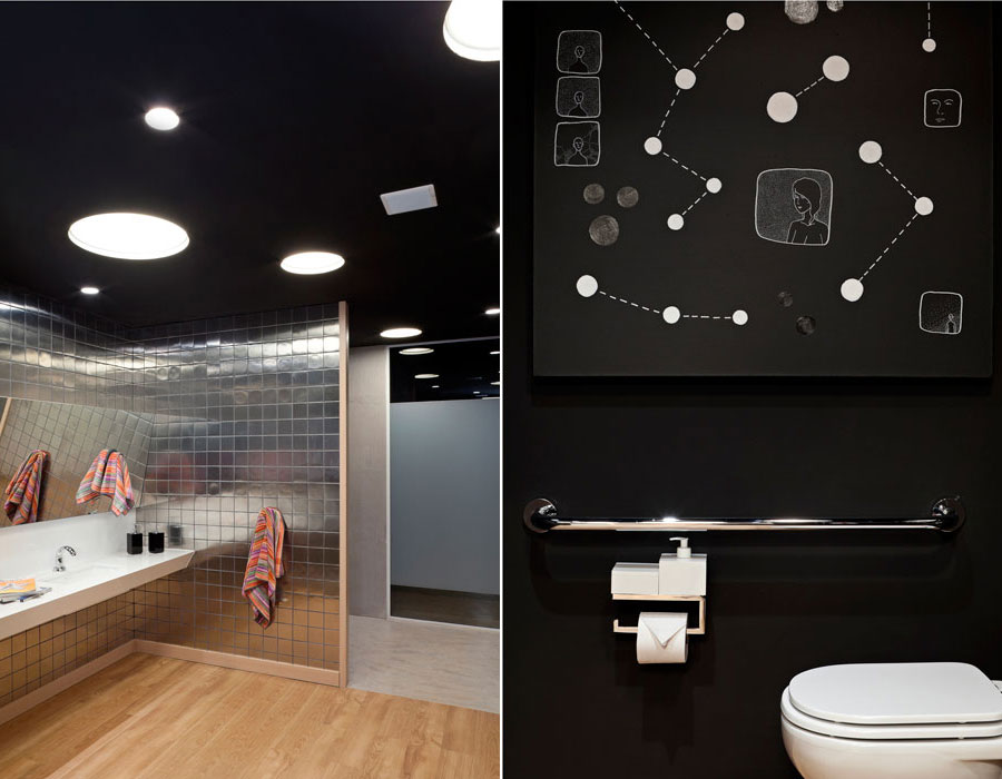
Moving to the bathroom the floor here is also wooden. However the walls are covered with a metallic tile and black ceiling. The size and arrangements of the canister ceiling lights creates a starry night effect. This theme is continued with constellation like artwork by the toilet. A shiny chrome grab bar and toilet paper holder then reflect back to the metallic tile. The sink and counter have good length and is roll under. A nice little accessible feature is in the mirror above the sink. If you look at the reflection of the tile you can tell the the mirror is tilted forward. This small tilt gives a wheelchair user a much better view of themselves.

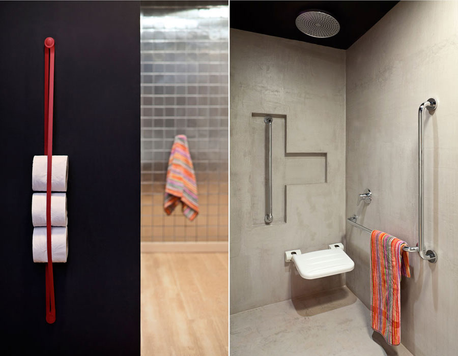
The shower area consists of grab bars, a wall mounted sink, and a rain head shower. An indented area breaks up the flat surface of the back wall and holds a vertical grab bar. To view more pictures of this modern chic space, visit this translated Casa de Valentino article.
