Bad Design Style: Case #12

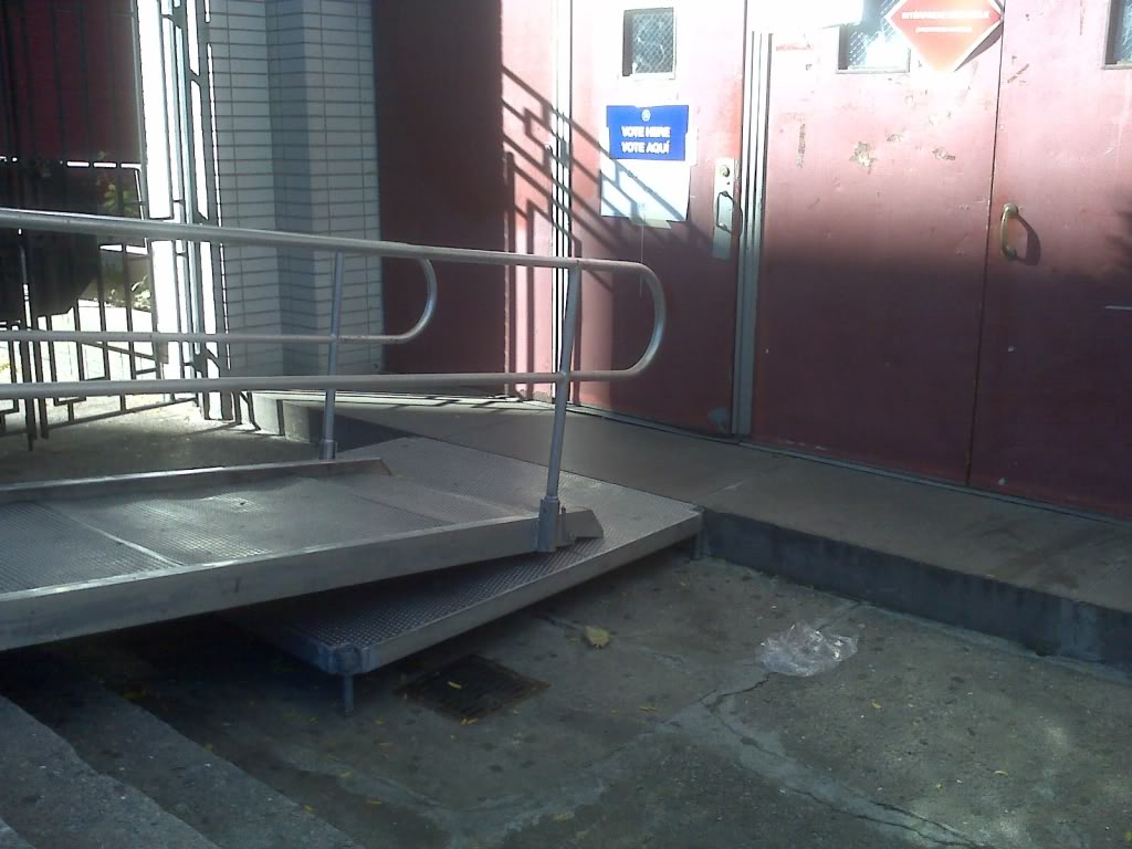
The worst part of this picture is the sign on the door that says “VOTE HERE”. Alright that may not be the worst part but it makes the situation worse. They are at least trying to make this voting center wheelchair accessible, but there could’ve been a better way. The biggest problem is that the landing is so short and small that opening the door would be difficult or impossible.
Ideally the building should be made accessible according to ADA design standards, or the voting center should be moved to an ADA compliant building. Voting is a right and voting centers are covered under the ADA because everyone should have access to their voting right. So go vote!
