Bad Design Style: Case #1

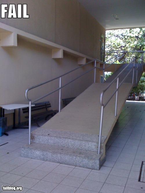
I’m pretty sure all of us have come across places that have made “attempts” at universal design but failed miserably. Whether it be accessible parking spaces that are incorrect, overly steep ramps, dangerous ramps, tight spaces, etc. Unfortunately despite ADA and other regulations, these barriers are still all too common. Which is why I decided to add another category to my blog, Bad Design Style. Here I’ll showcase examples of universal design gone awry. Along the way we can learn from mistakes and maybe at least have a few good laughs at ineptitude. Starting with the “ramp” pictured above from Fail Blog.
Wow, where to begin.
- Well lets start at the bottom of the ramp where there are stairs! Kinda defeats the purpose of a ramp in my opinion.
- Looks pretty steep to me. ADA code calls for 1:12 ratio slope. So for every inch high, the ramp goes out 12 inches. So if the top of a ramp is 12 inches off the ground, you would need a 12 foot ramp. This ramp looks quite a bit steeper.
- There is no side curbs or low railing guard. If a person using a wheelchair did brave this adventure ramp, their front wheels could potentially roll off the side edge.
- This ramp has so many bad parts that any good just seems ironic. At least there are hand rails and a middle landing. Really though I don’t think I’d feel safe even walking on this steep “ramp”.
