Bad Design Style: Case #10

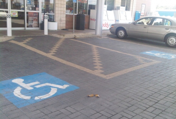
At first glance the disabled parking spaces pictured above looks to be good. The size, spacing, and marking look to be correct. The striping pattern even looks very nice with the brickwork. However the problem is with the striped access aisle location, it’s on the ramp.
Why is this a problem? Because the striped access aisle is supposed to be the space for entering and exiting a vehicle. Whether that be a lift, ramp, or transferring in and out of a wheelchair. Doing any of the above would not be ideal on a sloped access aisle. A lift would be lowering onto an uneven surface and would not be flush with the ground. Same with a ramp. Then trying to transfer in and out of a wheelchair that’s on a slope can be difficult and unsafe.
Here is what the original ADA design standards stated about parking spaces and access aisled:
4.6.3* Parking Spaces. Accessible parking spaces shall be at least 96 in (2440 mm) wide. Parking access aisles shall be part of an accessible route to the building or facility entrance and shall comply with 4.3. Two accessible parking spaces may share a common access aisle (see Fig. 9). Parked vehicle overhangs shall not reduce the clear width of an accessible route. Parking spaces and access aisles shall be level with surface slopes not exceeding 1:50 (2%) in all directions.
The 2010 ADA design standards go even further:
502.4 Floor or Ground Surfaces. Parking spaces and access aisles serving them shall comply with 302. Access aisles shall be at the same level as the parking spaces they serve. Changes in level are not permitted.
EXCEPTION: Slopes not steeper than 1:48 shall be permitted.
Advisory 502.4 Floor or Ground Surfaces. Access aisles are required to be nearly level in all directions to provide a surface for wheelchair transfer to and from vehicles. The exception allows sufficient slope for drainage. Built-up curb ramps are not permitted to project into access aisles and parking spaces because they would create slopes greater than 1:48.
