Bad Design Style: Case #16

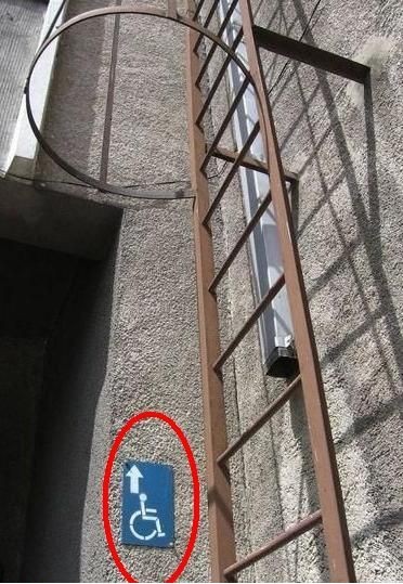
Alright, I’m going to just hope that this is a case of the photograph not telling the whole story here. Because if the accessible entrance truly is on the roof, then this is beyond ridiculous.
Really I’m hoping that if we could see more of the space, that the sign is telling people that the accessible entrance is down the hall/alley. If not, then the building owners don’t quite understand the ADA rule of having signs that point to the nearest accessible entrance. Either way, to have this sign with an upward arrow next to a ladder is quite amusing in its outrageousness.
