Bad Design Style: Case #21

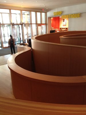
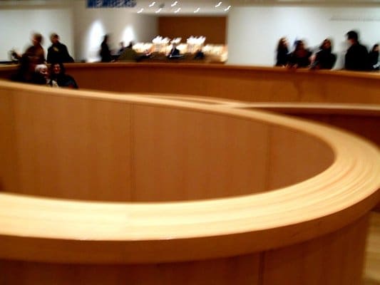
Alright I hate that I have to criticize this design because I love the work of the person who designed it. This windy ramp is located at the Art Gallery of Ontario and was designed by famed architect Frank Gehry. Who is known for his organic and outrageous designs that give structural engineers nightmares. I was able to see his Walt Disney Concert Hall during a visit to Los Angeles a few years ago and was in awe. However this ramp, though beautiful, is not the best example of functionality.

This ramp is right at the entrance lobby and does need to be used by wheelchair users if they want to go further. The slope appears to be fine but there are no handrails and then there are the turns! Trying to navigate up and down the ramp would take some arm, wrist, and hand dexterity. Whether using a manual or electric wheelchair. The walls are also pretty tall which creates blind turns and the possibility of running into people coming around the bend. I know of some people who have severe motion sickness where even suttle turns can make them feel woozy. This twisty turny ramp would not help. Again, I hate to criticize Frank Gehry, but this ramp could’ve been better.

