Bad Design Style: Case #22

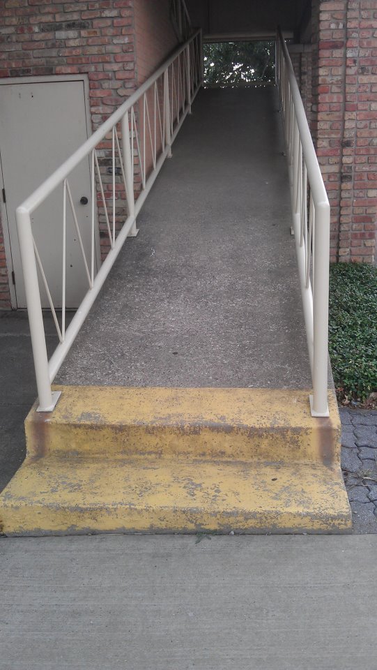
Alright this ramp is strikingly similar to the first Bad Design Style article I did. Which is not a compliment by any means. Come on, a ramp with stairs at the bottom. And no, the yellow paint at the bottom does not help or make anything safer.
Not only are there stairs at the bottom of this ramp, but the slope is way too steep. Going up to a second floor with a ramp would require approximately a 110 foot long ramp if you’re going to be ADA compliant. This ramp does not qualify. At least there are handrails on each side. But I can tell you that the openings in the railings are too big and not building code compliant. Why is this bad? Because a child could climb up the outside and get their head stuck in the “V” of the railing. Potentially hanging themselves. A dangerous all the way around.
