Bad Design Style: Case #26

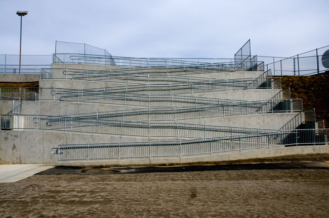
I’m going to guess that the designer of this ramp did not test out any ramps on their own using a manual wheelchair. If they did, they might realize this monstrosity of a ramp design is not acceptable. According to this article from 2009 by the Voice of San Diego, this is from a high school football stadium. A ramp deemed by federal observers to be inaccessible. Obviously.
By my count there are EIGHT runs and turns on this ramp. Let’s just be conservative and say that each ramp run is 30 feet long. That means the total distance is 240 feet! And that’s not even including the turns. Inaccessible not only for wheelchairs but also walker users, crutch users, and cane users.
The federal observers also noted that the ramp tended to be used by students and others which would clog up the ramp. Making the ramp even more inaccessible. Another picture from the article shows that the stadium has only one high side. With the money spent on this ramp, a platform lift or elevator could have been installed at a lower section. For probably about the same cost. Hopefully a better solution has been done since the Voice of San Diego’s article.
