Bad Design Style: Case #27

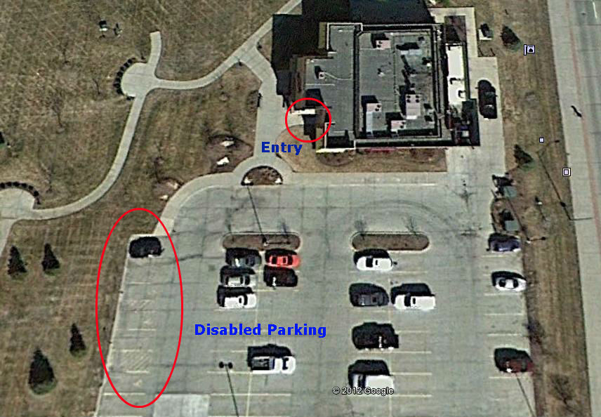
Alright, this is an aerial view of a restaurant that my family had gone to a handful of times a few years ago. At the time my Dad used a walker and had difficulty walking. As can be seen by the picture above, there is no short walking distance from any of the parking spots. Not only that, but the disabled (handicapped) parking spots are not laid out correctly and according to the ADA.
First off, even the closest parking spot to the entrance (which is not a disabled parking spot) is approximately 80 feet away! The closest disabled parking spot is approximately 100 feet away from the entrance! The farthest disabled parking spot is approximately 150 feet away from the entrance! I should have to use this many exclamation points!
At the least, all of the disabled parking spots should be along that front row and closest to the entrance. Which is according to the ADA. Even better, those spots should be closer to the entrance and up to the entrance sidewalk. The driving lane then moved down behind these spots. Even then, the entrance is a little far away at about 60 feet.
Designers here sacrificed accessibility for an aesthetic looking entrance. Violating the ADA code in the process. Asking someone who uses a walker, cane, crutches, or wheelchair to travel that distance is unacceptable. Needless to say my family stopped going to this restaurant, especially after the food became subpar also.
