Bad Design Style: Case #31

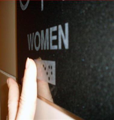
Well this is just all wrong. If my memory serves me right, I do believe that braille is supposed to be raised and tactile. This sign appears to have braille that is perfectly smooth to the touch. Not exactly useful for people unable to see the dots. Obviously the sign maker screwed up but how did the sign still get installed without anyone addressing the problem? Many people failed on this one.
Not only is the the braille not tactile, but the lettering is not raised either. If this sign is in the U.S., then ADA calls for raised characters. This sign might as well just be another tile on the wall. Because it’s not communicating to everyone as it should.
