Bad Design Style: Case #36

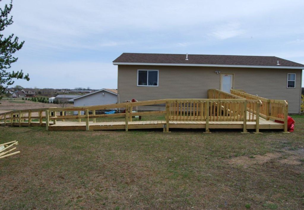
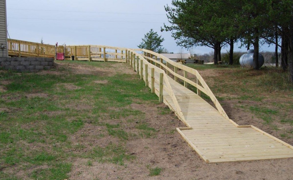
This is a ramp that a construction company was using as an example of how to build wheelchair ramps. Now I’m not saying that the ramp isn’t functional, but it’s not the best example to use. This would not be the typical way a wheelchair ramp should be constructed for a residential house. The ramp is extremely long and there’s a few things I would do differently.
The house is up on a hill so making an entrance is going to be quite a challenge. So they’re working with the logistics they’re given. And the structure looks secure so I’m not criticizing that. However the first run of ramp from the house leads to a landing that has an open side with no railing. I think they’re planning to put some stairs here but still, the bottom of a ramp should not lead straight to a drop off. The stairway should be on the adjacent side.
Given that the ramp doesn’t look to be finished, maybe they planned on doing so later, but part of the ramp has balusters and lower edge protection while the rest does not. Manual wheelchair front wheels could potentially slip off the sides without a lower guard to block this. Now there is a nice sized landing at the bottom where I assume a vehicle could be parked. But I’ve never been a fan of placing wood into the ground like this even if it’s pressure treated. I feel concrete is a better option.
Again the intention is good and the implementation not terrible. But there are some changes that could make this ramp more functional and safer. And it should not be used as a teaching tool example on how to construct other wheelchair ramps.

