Bad Design Style: Case #49
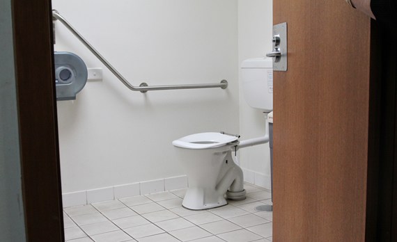
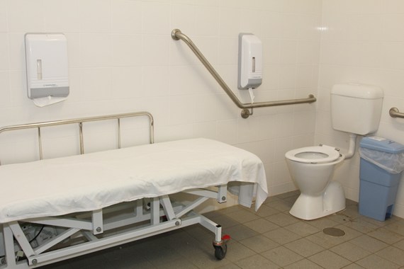
This week’s Bad Design Style case isn’t necessarily bad but very unusual to my eyes. These pictures come from Australia and are shown as examples of accessible toilets. But the shape of the toilet and grab bars are very different from U.S. ADA requirements.
Separation Anxiety
The first thing I noticed was how the toilet seat is separated from the tank. Judging from the picture the seat appears to me almost a foot in from of the tank. I’m not sure what the purpose of this is and if someone wanted to lean back they couldn’t.
Grab Barring
Second curiosity is the grab bars. The one on the adjacent wall is horizontal and then angles upward quite a bit. Which I’m sure if for when someone is standing up. Though the horizontal potion looks to be a bit high compared to ADA standards. There’s also no horizontal bar directly behind the toilet. There’s one off to the side a bit but this would not be useful for wheelchair users who prefer a forward angled transfer. That transfer requires grabbing onto both grab bars and pulling yourself onto the toilet.
Conclusion
So not totally inaccessible but again very unusual to me. If any of you have explanations feel free to comment below.


