Bad Design Style: Case #50

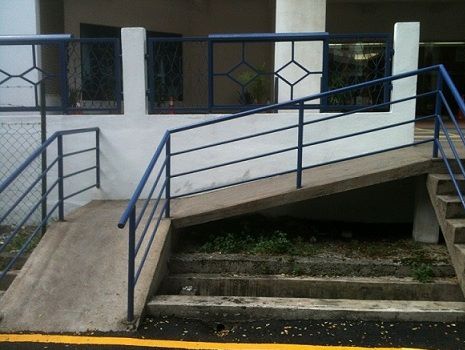
Bad Design Style has reached the number 50 milestone. Though I guess milestones shouldn’t really be celebrated with this category. Sadly I have no problems finding examples of bad accessible design. This week’s case comes from a library in Malaysia. One with a ramp, but a ramp that would not meet ADA standards.
You can tell from the picture that the ramp is not original to the building and was added on. Which is good that they tried to add accessibility. However the slopes are too steep to go up easily and go down safely. Plus the landing at the turn is too small and would be a tight if not impossible turn to make. Finally there are no handrails for the top run as would be required by the ADA. The writer of the blog from where this picture comes from also mentions that they were not able to find any marked accessible parking spaces. So the inclusion of a ramp is appreciated, but do it right.
