Bad Design Style: Case #55

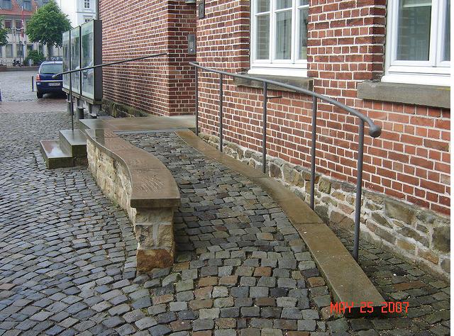
I talk a lot about the balance of form and function in my articles, but I always emphasize that function should come first. Because even if something looks beautiful, what use is it if it’s intended use is flawed. You could have the fanciest pen in the world but if it doesn’t write well then you have a decoration piece. For universal design, function is especially important because safety can be an issue. So that brings us to this wheelchair ramp out of Germany. Sure it blends in with the rest of the street, but there are some correctable flaws here.
I know whoever designed this ramp wanted it to blend in with the cobblestone street. The problem with that is we have a very bumpy surface that’s not exactly wheelchair friendly. Some of the gaps between the stone are pretty significant and a front wheel could get caught. The stairways and landings are concrete so the ramp surface could be also. Even with a concrete surface the ramp would still look nice. I would also at least put a lower bar on the guardrail at the top landing. If these changes and a second handrail were put up, then we’d have a nice looking and functional wheelchair ramp.
