Bad Design Style: Case #6

Braille braille/brāl/ Noun: A system of writing and printing for blind or visually impaired people, in which varied arrangements of raised dots representing letters and numerals are identified by touch.
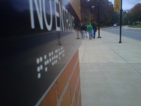
Looks like whoever made this sign didn’t take up the time to look up the definition of braille. A “NO ENTRANCE” sign with smooth braille. I’m going to go ahead and state the obvious that this is not ADA compliant.
At least the dots are high contrast but come one! I told my friend and co-worker about this and he could only laugh because of the ridiculousness of the sign. So if a person who is blind walks into the “NO ENTRANCE” area, we can blame the sign.
