Bad Design Style: Case #76

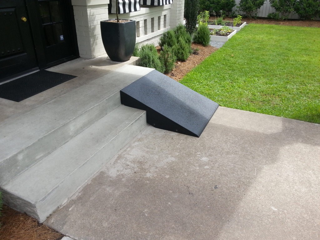
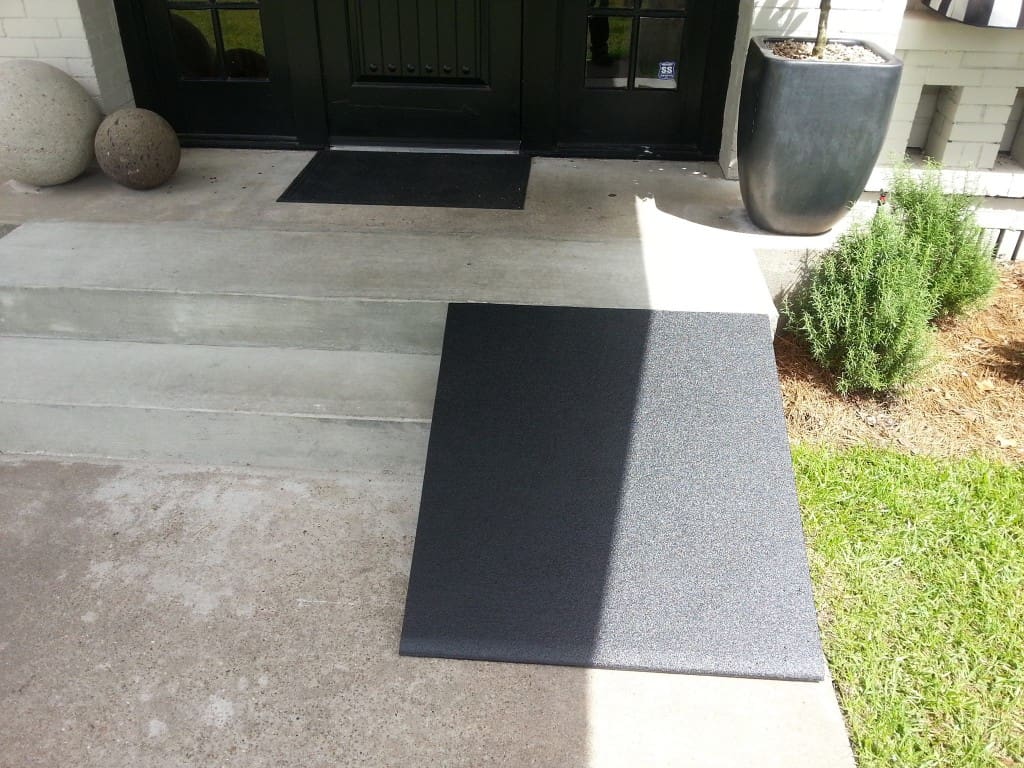
So this is a restaurant’s solution to make their entrance wheelchair accessible. Sorry but that is not a good solution nor is it ADA compliant. Too steep, too narrow, no guards, and too dangerous.
I believe they didn’t want to mess with the existing look of their entry and took the easy way out. The thing is you can tell that the concrete stairs are newer, so a proper wheelchair accessible entrance should have been put in at time. And with only two steps this wouldn’t have been hard to do.

