Bad Design Style: Case #8

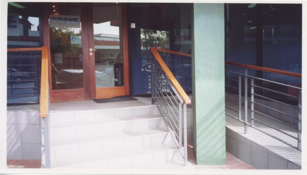
This case of bad design comes by way of our friends down under in Australia. The Australian Human Rights Commission has a very informative webpage that features examples of good accessible design and bad accessible design. This building entrance is a case of bad accessible design. One thing people tend to forget about when it comes to ramps is the importance of a proper landing at the door. This one doesn’t work.
Imagine first going up the ramp here which should have a second handrail. Then coming onto the landing and trying to open the door which swings outward. All while being perched by the top of the stairs. There’s not enough room to do this safely or if at all. Then imagine coming out of the building and trying to turn back towards the ramp. The open door is now in the way and those close stairs are still there.
Two things would make the landing safer and more accessible. First the landing should be deeper, at least 5ft. Next, the door swing should be where the latch side is on the same side as the ramp. This avoids having to go around the door when going in and out.
