Bad Design Style: Case #81

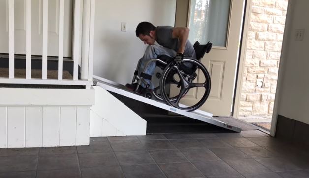
The image up this guy straining to get up a ramp is from a Youtube video. In the video the host is giving tips on how to get up a steep ramp. Although ideally steep ramps like this wouldn’t exist. So while the intent of this video is good, it’s still bad design style.
In this video he has a portable metal ramp at his front entrance. That landing is close to the front door which makes the ramp steep. The other problem is that the ramp blocks the front door from closing. If there is more room on the other side of the landing, I’d suggest putting in a long ramp on that side. Thus lowering the steepness.
As you can see from the picture, he is really straining. He is young and appears strong, not every wheelchair user is. Which is why ADA requires a 1:12 ratio ramp.

