Sounds Good | The Visual Hearing Aid
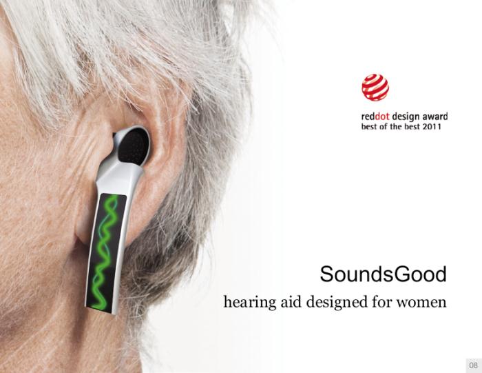
After the firs bulky hearing aid was first made, the goal since has been to make them less and less visible. To the point where now many hearing aid are hardly noticeable. Here we have a concept hearing aid where the goal is to be seen. Combining a hearing aid with jewelry and communication device. The Sounds Good hearing aid by Rhode Island School of Design student, Peiqi Tang, looks like an earring and lets others know when they’re speaking too loud or soft.
Color Waves
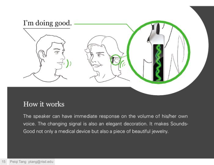
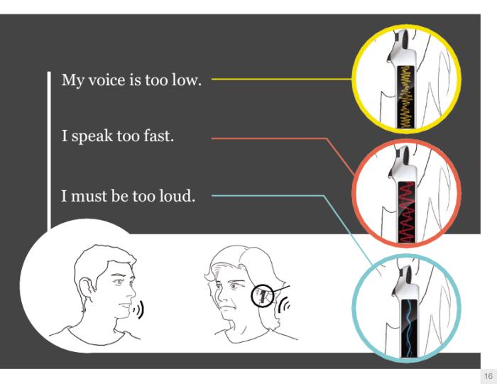
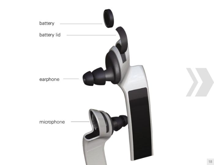
The Sounds Good hearing aid is an earbud style one that then has a skinny vertical screen that hangs down. Looking similar to a dangling earring instead of a hearing aid. Color coded sound waves appear on the vertical screen when in conversation. If the sound waves are green, you’re speaking in an understandable rate and volume. Yellow sound waves indicate that you need to speak up. Blue sound waves mean you need to tone it down. With Red sound waves you’re speaking too fast. The Sounds Good would be calibrated by a audiologist to find the best speaking volume and rate for each patient.
Community Criticism
Now I did ask some people in the deaf community what they thought of this concept. The basic response I got was that it’s kinda cool but impractical. Most thought that the hearing aid was not secure enough and would easily fall out. Others pointed out that other people would need to know what the color codes are in order to know how to adjust their voice. And others just didn’t like the look and found the use gimmicky.
Conclusion
Still the Sounds Good hearing aid concept is a cool design that brings a unique way for hearing aids to work. Maybe not practical but concepts are meant to further overall design. So maybe parts of this concept will be implemented in a more practical future product. To see more of Peiqi Tang’s portfolio visit this website.
