Universal Design Style Year End Top 10: Bad Design Style
Finally it’s time for the best of the worst. Basically here I tried to choose the most varied examples of bad design with “accessibility”. As always the most recent examples are first.
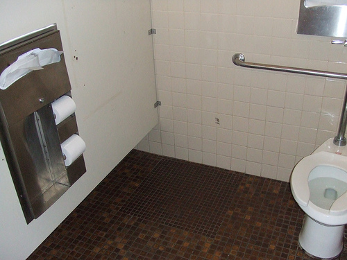
10. Hard to Reach T.P.
Unless this is Stretch Armstrong’s personal toilet, the toilet paper location is a problem.
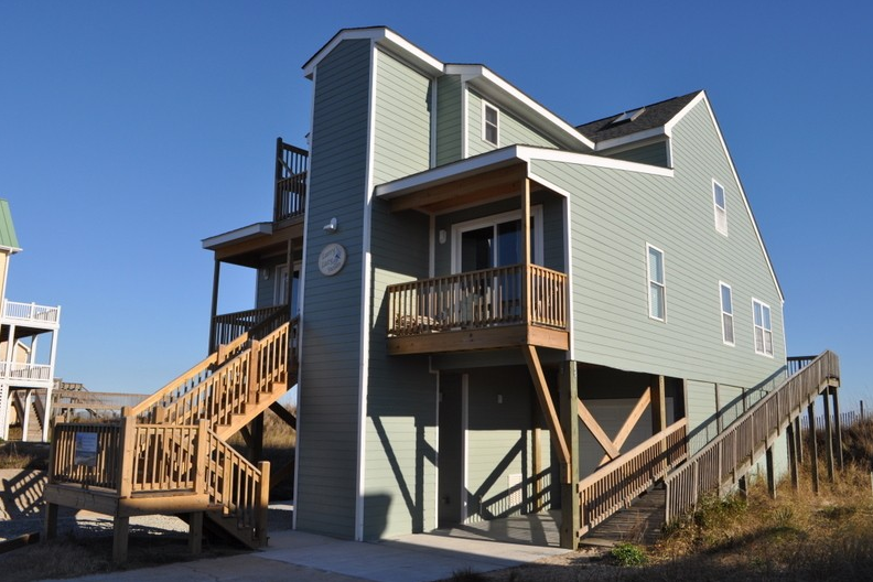
9. Vacation Home Steep Ramp
This house has an elevator so this incredibly long and steep ramp is not needed.
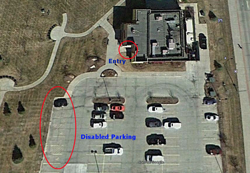
8. Long Distance Dinner
The disabled (handicapped) parking spots are not in the right location and are very far from the entrance.
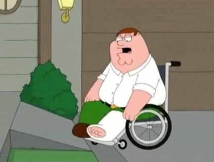
7. Badly Drawn
Yes it’s just a cartoon but media portrayals of accessibility do influence public opinion.
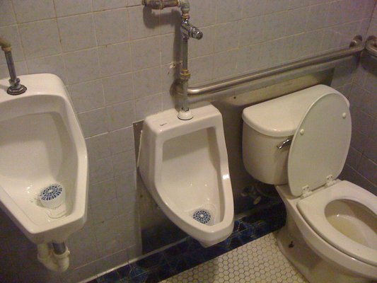
6. Too Close for Comfort
Not a lot of space here to park a wheelchair and transfer. Then there’s the privacy issue.
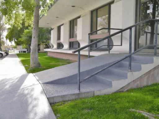
5. Sloping Everywhere
Let’s just try to put a slope everywhere possible and claim it’s accessible.
4. Pretty … but Dangerous
Very creative and beautiful to look at, but no edge protection or handrails equal a dangerous setup.
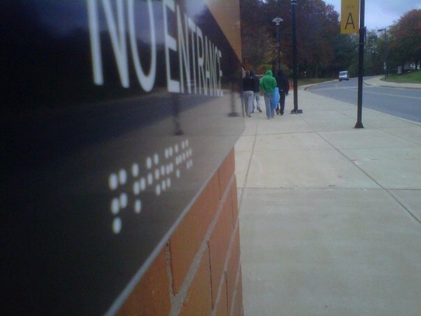
3. Smooth as Braille
Could someone please look up the definition of Braille for me? Thanks.
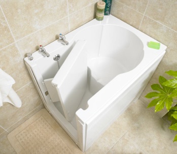
2. Lack of Legroom
Walk-in bathtubs can be useful, if you can shut the door without your legs in the way.
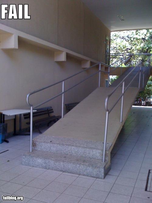
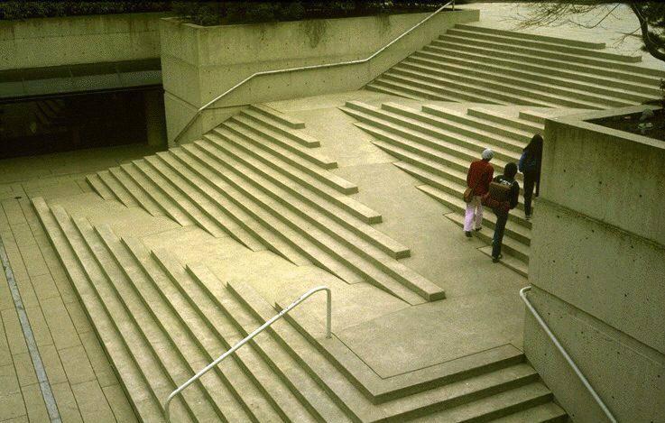
1. Ramp and Stairs in One
Some things just don’t work well together. Here’s an example.

